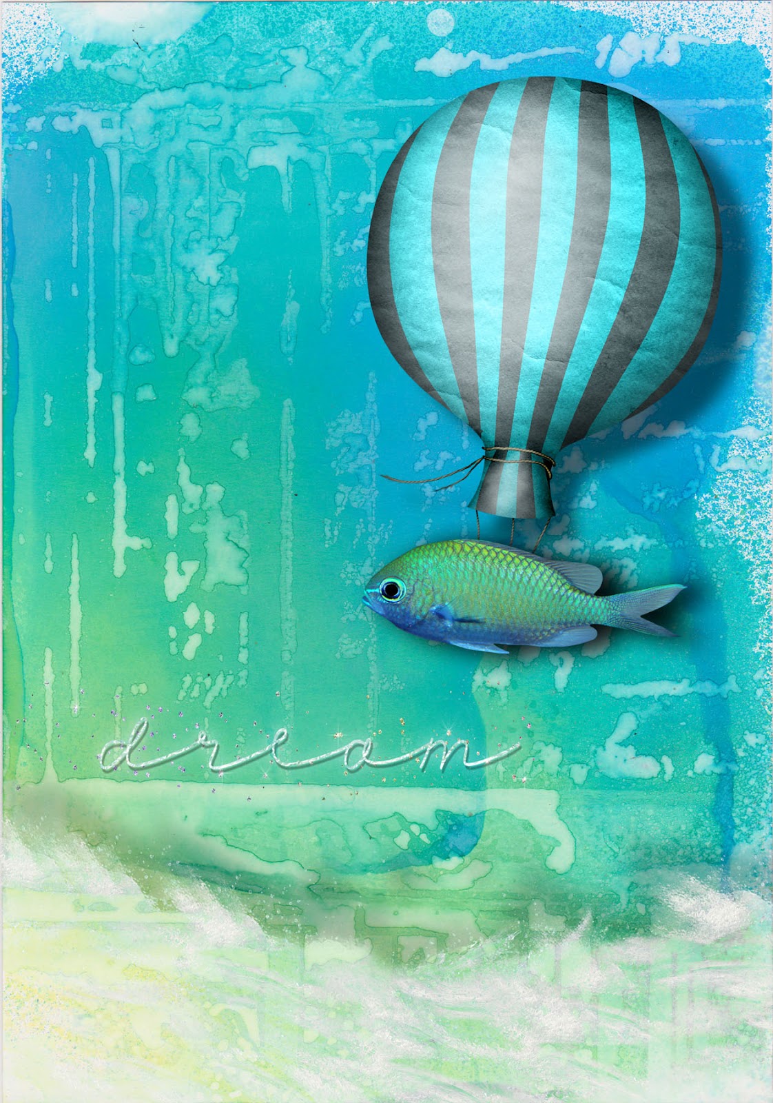
Here´s my turquoise postcard for this week´s
SPA challenge. I wanted the colour to stand out, so I didn´t use too many elements here. It´s a digital collage, but I´ve hand stenciled and sprayed the background. I´ve added elements from Nicole Young, Holliewood Studios, and Palvinka Designs.

and the color does stand out, Marion. It's beautiful. Sometimes less IS more, and this is a good example of that.
ReplyDelete(By the way, I really like your new blog header!)
This makes me want to go swim in the ocean! Love it.
ReplyDeleteThank you for the comment!
Beautiful underwater scene, Marion!
ReplyDeleteFilled with whimsey a great postcard!
ReplyDeletegreat postcard!
ReplyDeleteEine grandiose Kreation, liebe Marion! Echt super gelungen!
ReplyDeleteIt's wonderful! I love how you've let the colour be the hero.
ReplyDeleteGreat color mix in this!
ReplyDeleteLovely card. The turquoise colour is
ReplyDeletebeautiful! xx
very calm and relaxing!
ReplyDeleteGreat postcard !
ReplyDeletegefällt mir super gut, marion! ich nehm auch immer öfter selbstgemachte hintergründe bei digitalen werken, dann hab ich das gefühl, es ist was handwerkliches dabei.
ReplyDelete