
 "Brown combo" is this week´s theme for the Wednesday Stamper´s challenge.
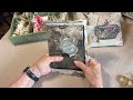
I´m not a brown person - after all that brown and orange that I´ve seen in my youth in the 70s, it took many years before I bought brown clothes again ... When it comes to mixed-media art, I prefer other colours, too. But what I really like is combining brown with black and white, copper or gold, and with all kinds of rust and patina. So here´s an example for my favourite colour combo with blue patina on brown paper, painted with copper ground. I´ve added some green and blue accents with pens and crayons.


22 comments:
Sehr interessante Kombi! Gefällt mir richtig gut!
LG Ilka
Wow sieht das klasse aus.
Wunderschöne Farben.
schöne farbkombi, gefällt mir sehr
Klasse gemacht!
Lg Anke
FABULOUS!!!
Beautiful work - I love the paint. Do you use ready made paint effects or mix your own?
Rosie, I have used Modern Options copper topper with blue patina solution, then Caran d´Ache Neocolor II crayons and Polychromos pens. So the paints and pens are ready, but the mix is mine ;-)
Marion, this is beautiful and very creative. The color combinations are some of my favorites, too.
so nicely done love the frame.
Great piece, Marion!
oh, she's lovely! It's funny because I also hate brown in my daily life, but it is one of my favorite crafting colors!
what a beautiful artwork.
Great card!!
Very incredible card.
Really beautiful card - I am opposite to you, I love browns and creams ..
Love the background and the stitches. Great combo.
Lovely card!
Beautiful!!
This is gorgeous, Marion! The colors are like verdegris with the copper, rust, turquoise! I love it and the painterly quality it has! And I am with you 100% on the browns of the '70s! All of the movies and TV programs were brown, also! Even so, I do mix-in quite a lot of brown with other colors today. Your piece is wonderful!!
I love it
Gorgeous colours and design !
You do brown VERY well Marion, Love how your winged lady looks here!
Post a Comment